And did I mention it cost a total of $11? You know I love a good bargain.
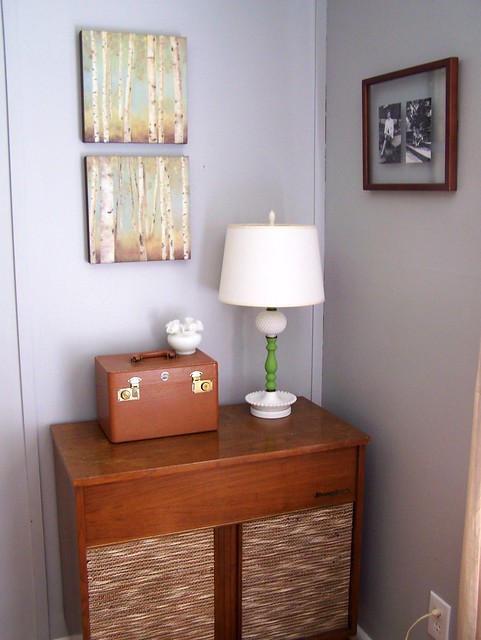
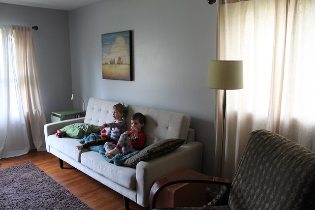
If you love before and afters like I do, let's take a look at the corner I'm talking about when it was our dining room. It looked like this...
I loved this whole vignette. From the artwork {from Kohl's} to the lamp to the Craigslist record player cabinet. Loved.it.
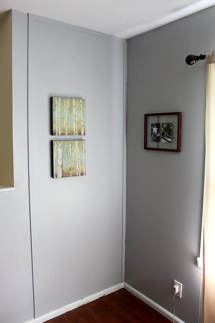
I loved the art so much in this corner that when we moved the cabinet to the new dining room space, I left it up. But it looked awfully lonely...
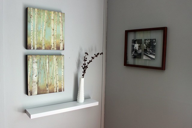
So I snagged a modern white floating shelf from Target, a vase from my milk glass collection, and a $1 stick of brown berries from Hobby Lobby and came up with this...
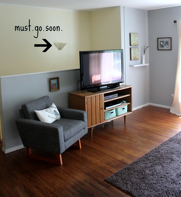
A simple display that really finishes off the corner. I love the contrast of the white against the gray walls and how the vase and berries fill in the empty space next to the artwork. Here is a wider view of that side of the room...
Please ignore Mr. Brass and Glass 80's sconce in the background. He is on the chopping block for sure. Hello odd light placement!
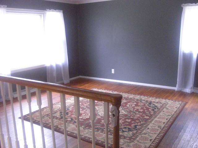
And just for kicks here are a few photos of the same side of the room from our inspection day a little over two years ago...
Quite a change huh?
The railing wasn't sturdy or up to code so it had to go. The half wall makes the space look so much cozier {not to mention safer!}
And here is the other side of the room before...
And after...
Projects still on my wish list for the family room:
- Replace Mr. Gold and Brass with a better sconce...maybe one like this?
- Paint the stairway walls and hallway the same shade of gray as the family room {anyone like heights? Because I am NOT a fan}
- Touch up all of the baseboards. I.am.so.lazy.

Linked up with...










12 comments:
That looks really good so far! I never would have known how to make that wall look good once the cabinet was moved, but you pulled it off nicely with the shelf. Interior design is SO not my area of talent. My walls are so bare and boring.
oh wow!
i love it!
♥elisabeth
Hi! I love your style - so me! I was wondering what your wall color is. I was looking for something like this for the masterbedroom.
Thanks Brenda - I'm not sure off the top of my head what the wall color is, but I will try to find it for you. :)
OooOO I love the prints of the trees with the white bark. It reminds me of home!
i love what you've done with the corner space! it's pretty, simple, and just enough.
I can't believe that corner artwork is from Kohl's ... looks great!
xox Lexi
Glitter & Pearls
You're house is too cute! I just bought an old bungalow last year. It's definitely a work in progress, but I love it!
You're right, just adding the little shelf and accessories make that corner sing! Nice work! Jen @ www.icantstopcrafting.blogspot.com
It's coming out great. Thanks for linking this to Wicked Awesome Wednesday.
Beautiful little corner! Your wall color is divine... and I love what you've done with little money! You may have spent a little, but your impact is big! jules
If you don't mind me asking - how much did it cost to build the half wall? We have a similar railing and would like to make the area more safe for our 2 year old but aren't sure if it is worth the cost. Thanks!!
Post a Comment